Button
Block Tab
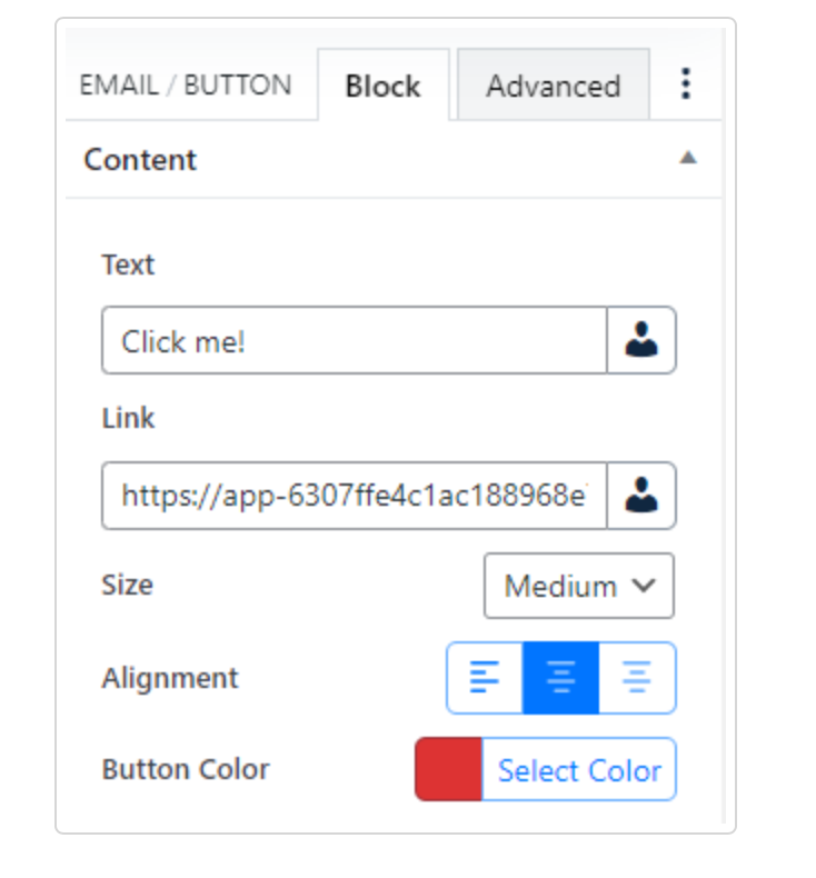
Content
- Text (Enter the text for the button, Replacement code)
- Link (Insert a URL, Replacement code)
- Size (Small, Medium, Large – Default: Medium)
- Alignment (Right, Center, Left – Default: Center)
- Button Color (Color picker with the global colors – Default: #dd3333(red))
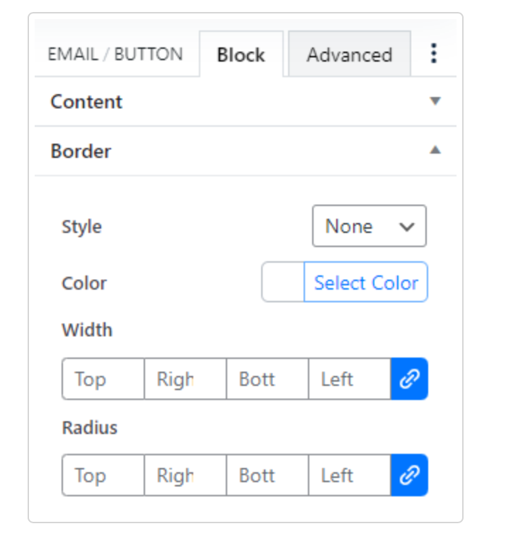
Border
- Style (None, Solid, Dashed, Dotted, Double, Ridge, Grouve, Inset, Outset – Default: None)
- Color (Color picker with the global colors)
- Width (based on pixels and you can link/unlink the setting)
- Radius (based on pixels and you can link/unlink the setting)
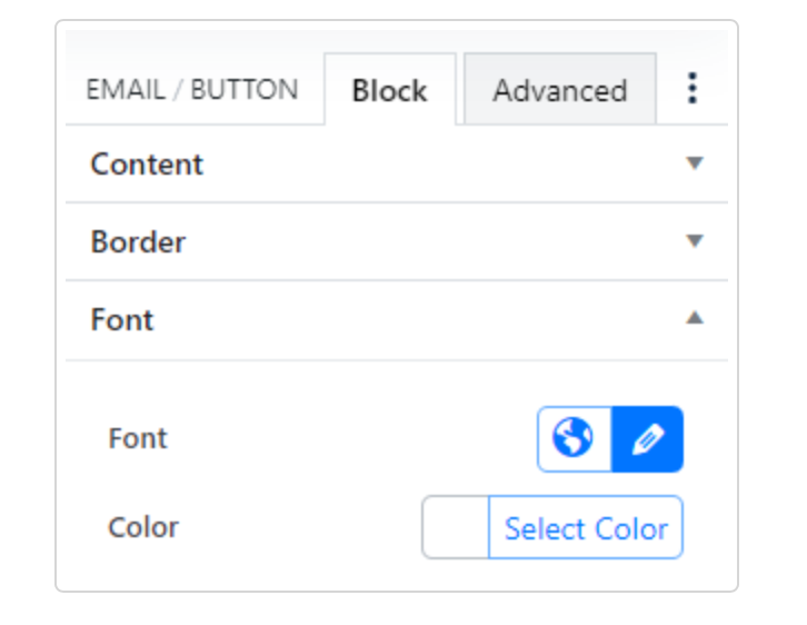
Font
- Font( Globe gives you access to the global type settings, and the pencil edits specific Font Family, Font Size, Line Height, Font Weight, Font Style, and Transform)
- Color(Color picker with the global colors